Favorite Sample Type
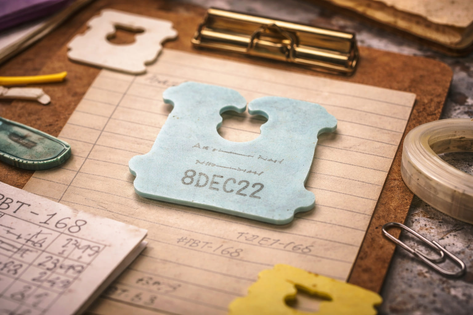
Pale blue, matte surface, narrow aperture, flat-edge type B. Marina would never call it elegant in public, but the word would be accurate.
shrine room / favored artifacts / controlled sentiment
A less official chamber of the archive for the objects Marina would never call beloved too loudly, even though she obviously means it.
Most of the site speaks in the language of records, categories, and storage assignments. This page speaks a little closer to attachment. Not sentimentality exactly. More like sustained regard.
Marina would not say that these objects are beautiful in any dramatic or decorative sense. She would say they are well-behaved, structurally satisfying, or unusually complete examples of their type. That is the language affection uses here.
The shrine exists because some archive relationships become difficult to describe using only counts and box numbers.
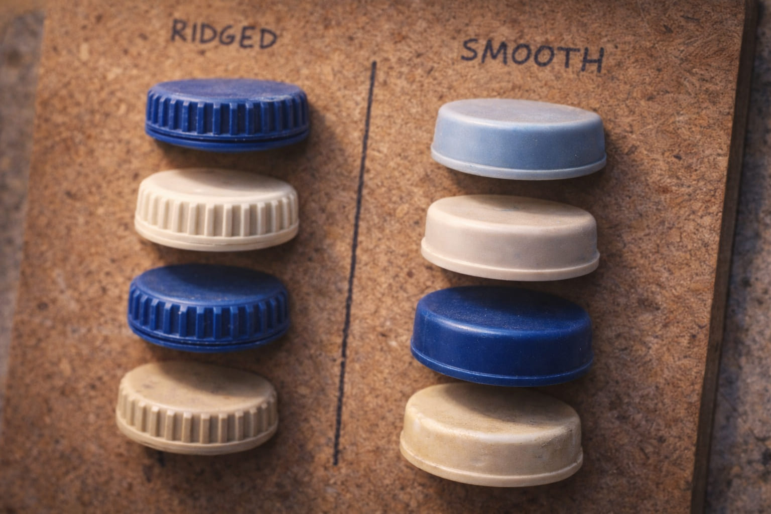
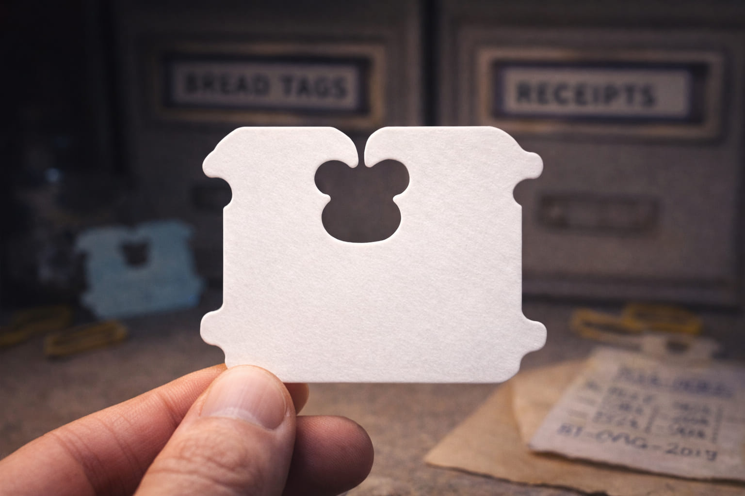
Bread tags are the archive’s most persuasive category because they combine repetition with variation at exactly the right scale. They are small enough to overlook, numerous enough to compare, and distinct enough to classify without forcing the system.
Marina’s private favorite subgroup is pale blue. Not because it is the rarest, but because it feels like a design decision that did not need to happen. White would have been enough. Pale blue implies surplus thought.
A good bread tag has a crisp aperture, stable plastic, modest hinge proportion, and an edge profile that avoids looking cheap without becoming ornate. The very best examples feel precise in the fingers before they become precise in the notes.
Pale blue, matte surface, narrow aperture, flat-edge type B. Marina would never call it elegant in public, but the word would be accurate.
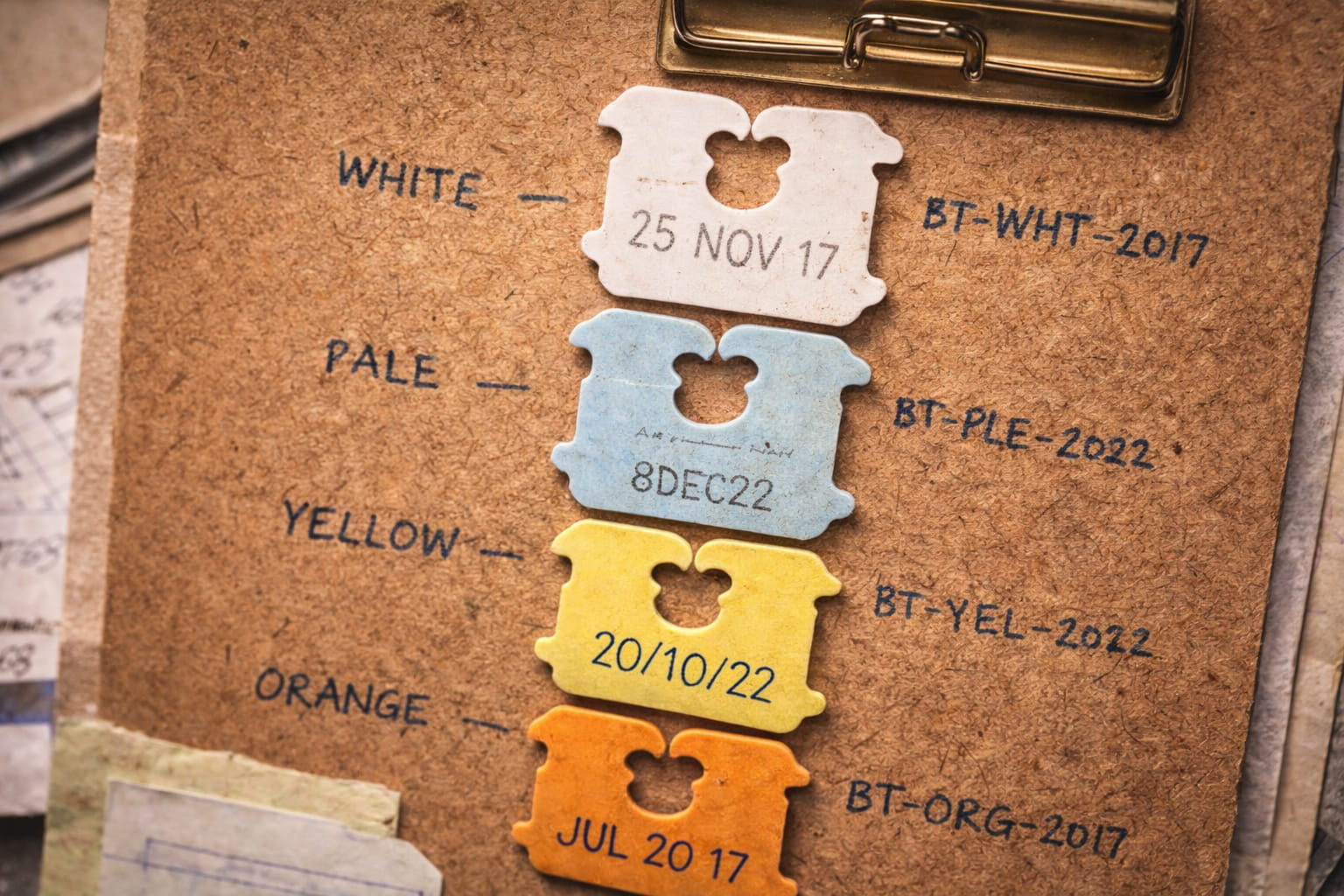
White through cream through pale beige. The shrine version of this board exists because comparison itself became emotionally persuasive.
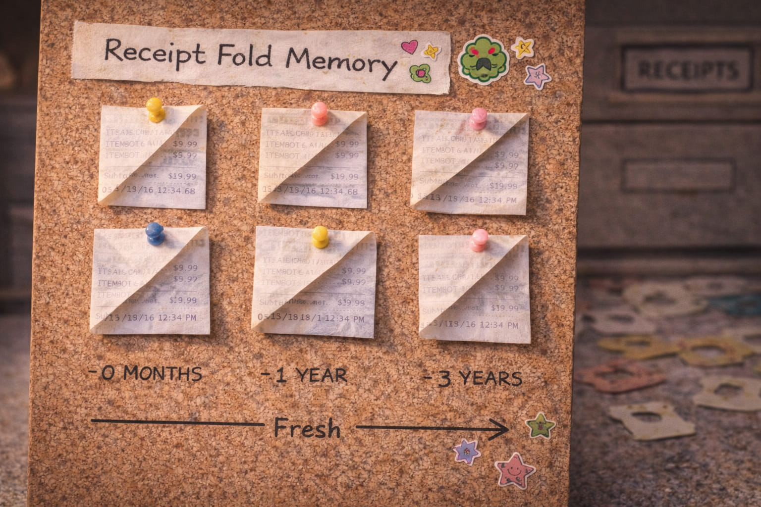
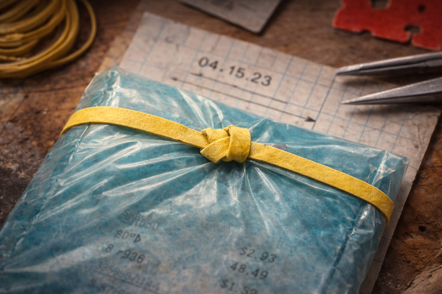
Receipts are not favorites because they are pretty. They are favorites because they fail in a revealing way. They are documents built for near-immediate loss, and the archive resists that loss one slip at a time.
Marina is especially drawn to receipts where only part of the text survives: the subtotal remains, the chain name fades, the item lines blur, the date persists with irritating confidence. They become partial witnesses.
There is something unusually moving about a document that still insists it existed while steadily refusing to tell the full story anymore.
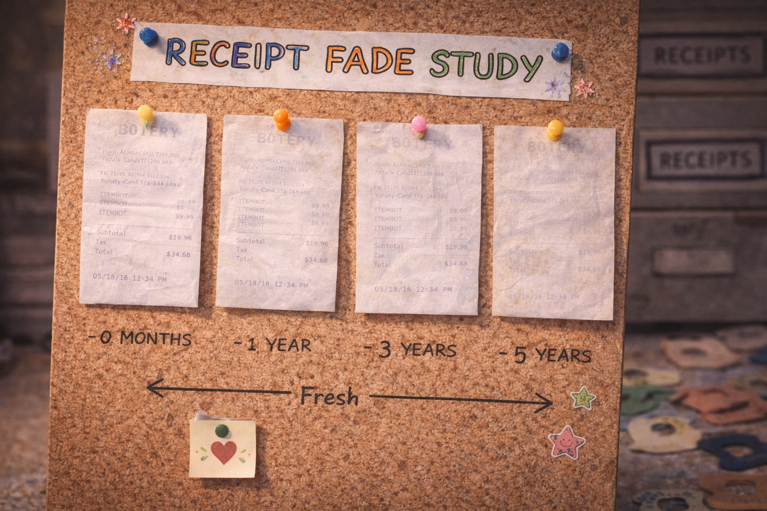
A preferred failure type. Information disappears from the beginning downward, leaving the lower transaction lines strangely intact.
Not pleasant exactly, but satisfying in the way a strong material tendency is satisfying when it can be named clearly.
Bottle caps became important slowly. At first they seemed too repetitive, too obvious, too solved. Then the differences started to stack up: ridge count, wall thickness, emboss depth, opening feel, edge sharpness, color saturation.
Marina’s preferred examples are usually blue water caps from just before the visible simplification wave. They still have enough physical conviction to feel designed rather than merely produced.
The shrine version of the cap archive is not about brands. It is about the tactile memory of minor manufacturing standards before they were thinned.
The clearest demonstration that “basically the same” is often not actually the same at all.
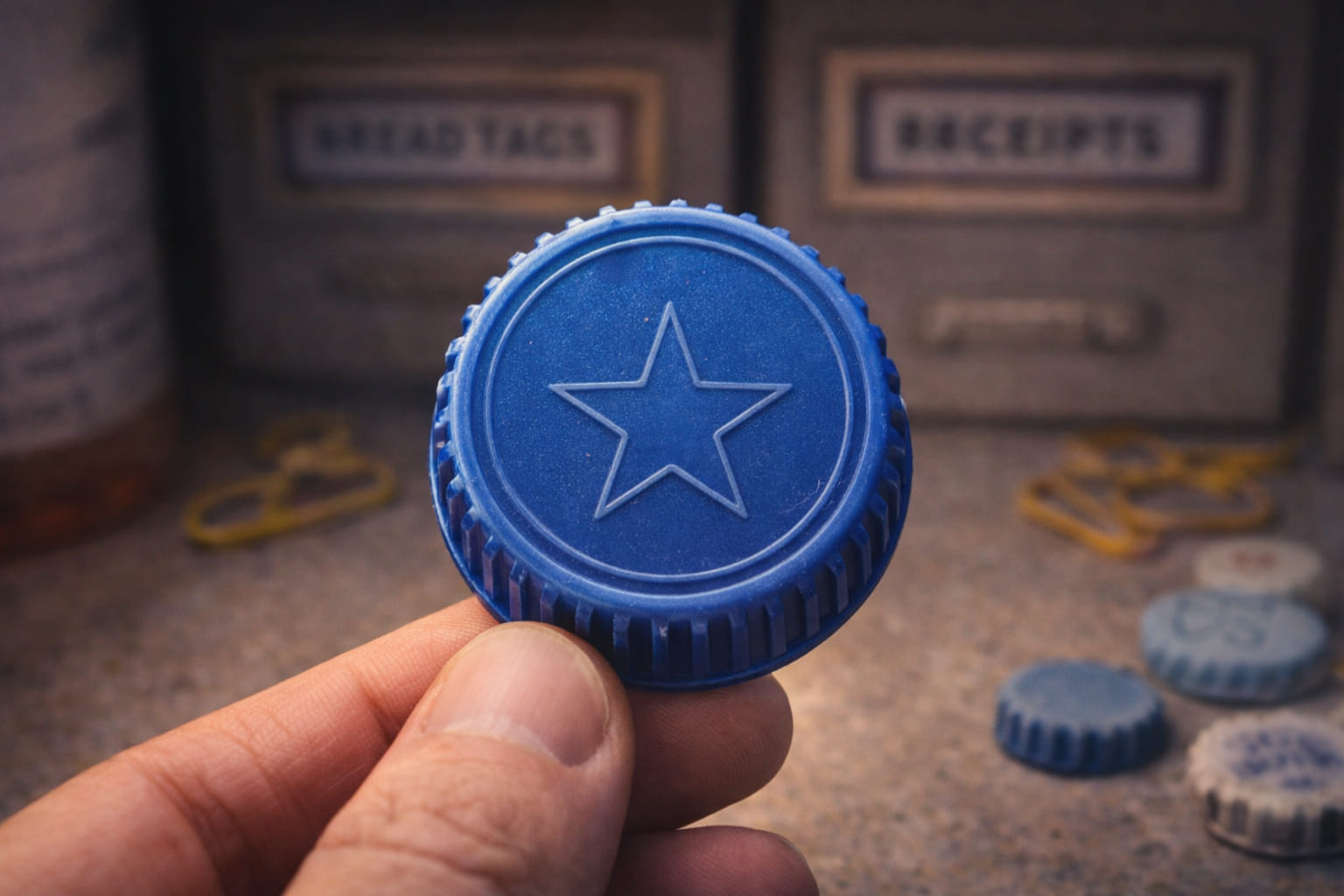
Slightly deeper embossing, firmer wall, cleaner ridge transitions. Quietly superior.
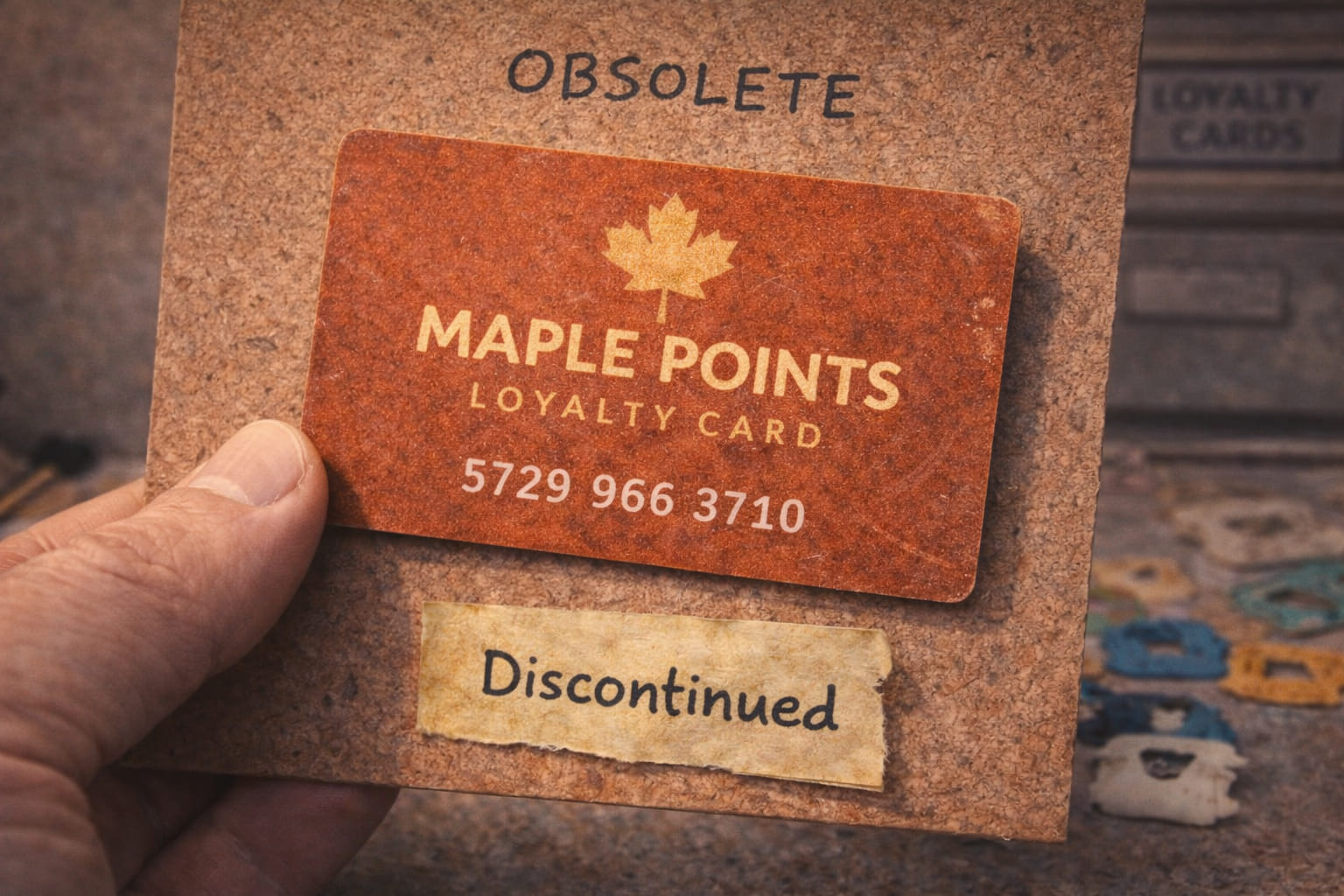
Not everything Marina cares about becomes a formal collection. Some things remain nearby instead: good index cards, favorite pencils, specific label rolls, especially cooperative rubber bands, a chipped mug that appears in the background of intake sessions.
These are not core records, but they stabilize the ritual of classification. They are part of the archive’s emotional weather.
The standard is not boring when it is done well. Precision can survive mass production in small pockets.
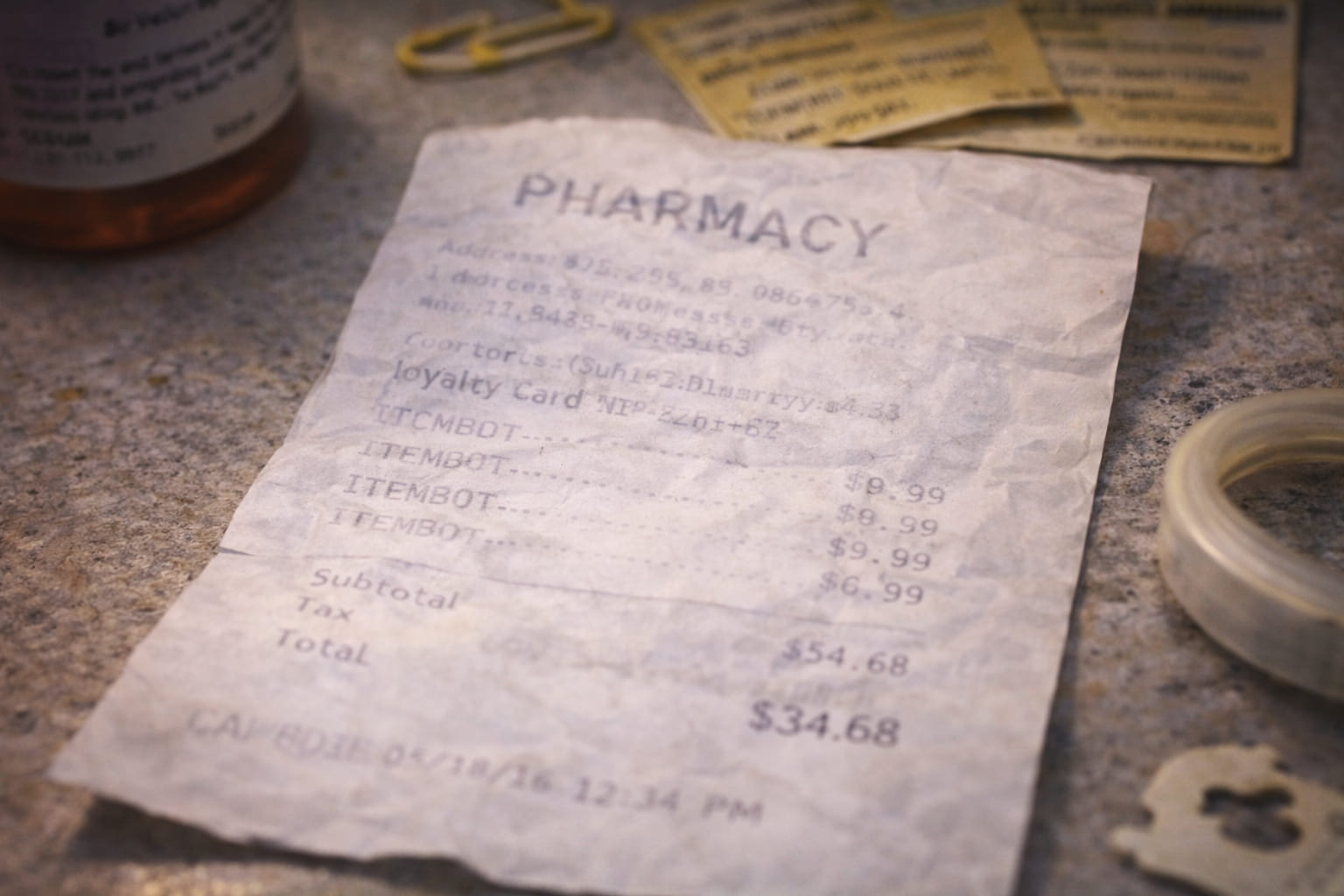
A preferred fade pattern: chain title weakened, subtotal still stubbornly dark.
Good paper wrap, calm wire rebound, absolutely cooperative.
Not a major category driver, but an excellent atmosphere object. Surface wear often feels more truthful than pristine examples.
Systems often pretend to be emotionless, but durable systems usually have preferences hidden inside them. Certain objects receive more careful language. Certain subgroups generate more comparison boards. Certain materials are described with a precision that exceeds necessity.
The shrine page makes those preferences visible without dissolving the archive into confession. It admits that rigor and attachment are not opposites. Repeated attention turns one into the other.
If the main archive is the filing cabinet, this page is the drawer that opens a little more slowly because the objects inside it matter in a slightly different way.